You may have a brand spanking new website, but does it pass these three accessibility tests?
Why is accessibility important?
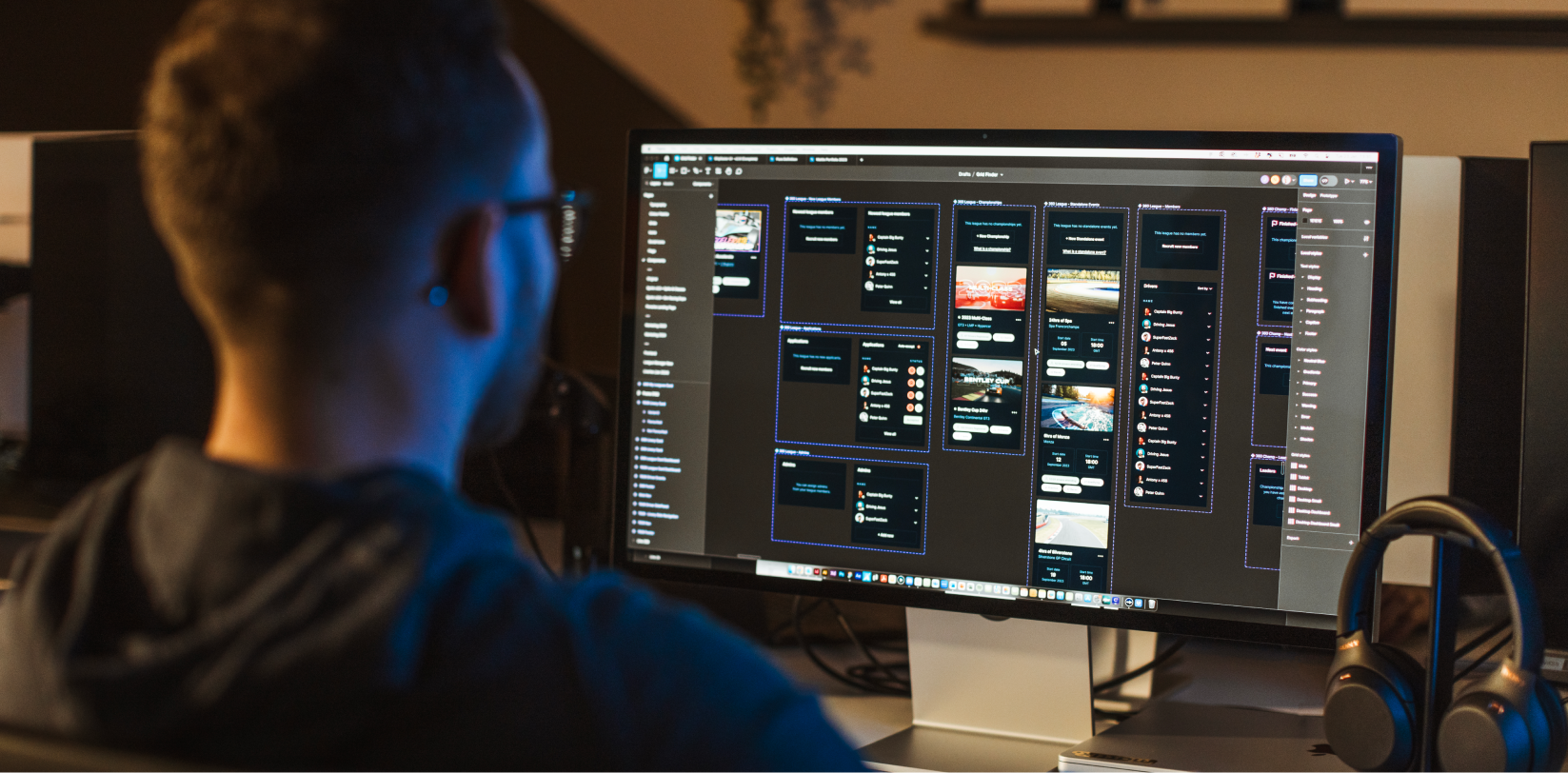
Accessibility plays a major role in web design. Whether you are a business, designer or developer, creating a high-quality professional website involves ensuring that the information is accessible to people of all abilities.
The main benefit of web accessibility is to avoid excluding those with disabilities from using and enjoying your services and products.
However, there are a number of additional advantages, too.
For example, a focus on accessibility can help those who are using mobile phones and devices to view your site. Meanwhile, if someone is looking at their screen in bright sunlight, or using a slow internet connection, they can still use your website because it is simple to read and understand.
In short, whilst a brand needs to look great and be engaging, it must also feature easily-adaptable design elements that can be utilised throughout their websites and other marketing material.
We’ve come up with three actionable tips to boost the accessibility of your website.
Check the colours.
There are a lot of people out there who struggle to read for various reasons. This is often worsened when the colours of text are not well thought through.
To give an example, some may not be able to read the copy on your website if there is not a sufficient contrast between the text and the background colour.
Colour blindness affects 1 in 12 men and 1 in 200 women in the world, so the hues of your website are certainly something to keep in mind.
Avoid shade combinations such as:
- Green and red
- Green and brown
- Blue and purple
- Green and blue
- Light green and yellow
- Blue and grey
- Grey and green
- Green and black
A handy tool to check your chosen colours is The Paciello Group Colour Contrast Analyser. Simply input your brand pantone colour into this nifty piece of software and it will tell you whether they can be read with ease. An added bonus is that the Analyser shows you how these colours appear to someone with different severities of colour blindness.
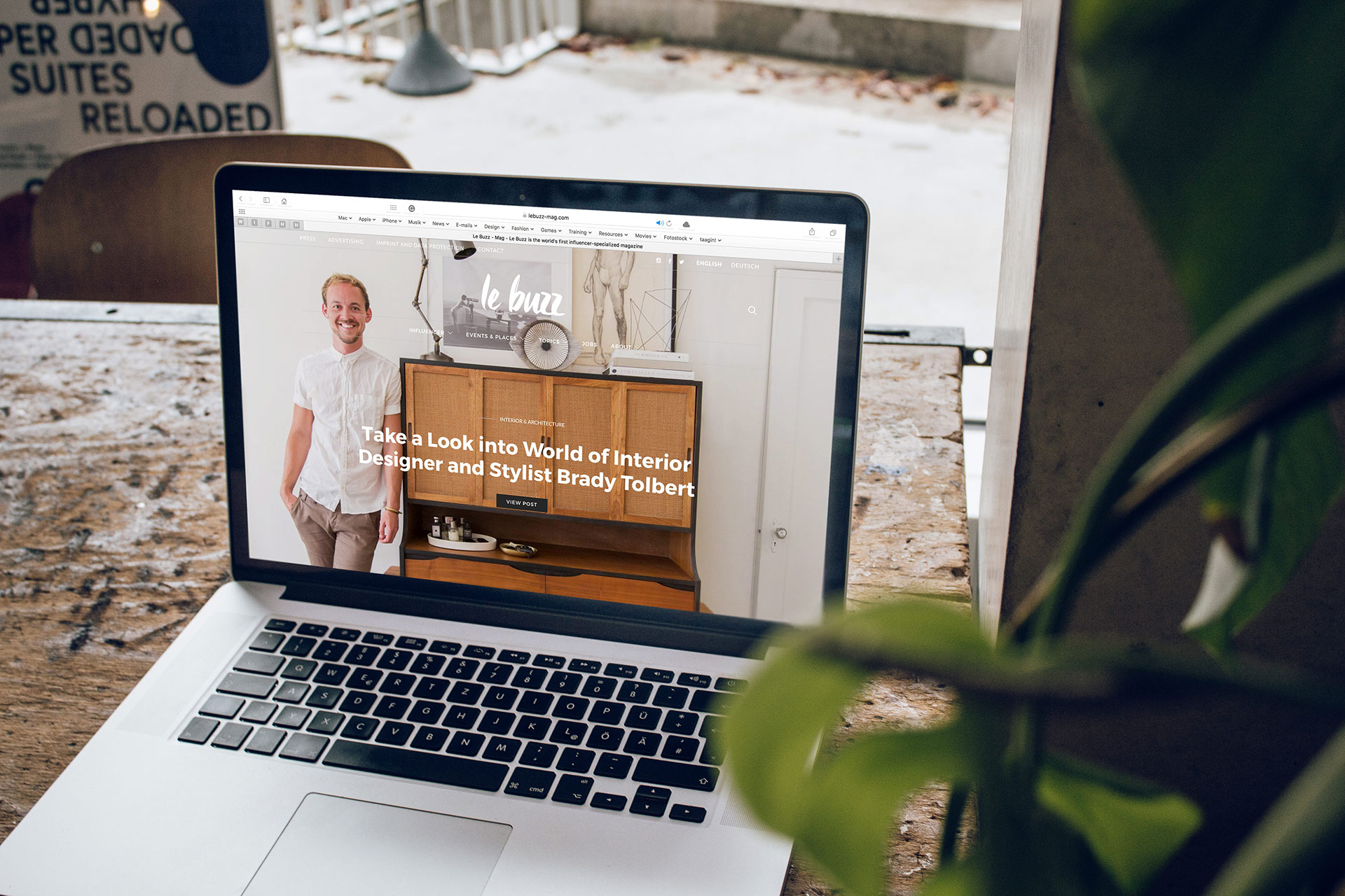
Tread carefully with typography.
As we have mentioned before, choosing the right font for your brand identity is key.
Typography is one of the most important aspects of any website. After all, one of the main ways we communicate with our audiences online is via copy.
The human brain sees letters and words as shapes. By using a font that emphasises these silhouettes, you can improve the accessibility of your website.
So, when selecting a font, pay close attention to the way the letters are drawn. Stay away from those that use the same figure for “b”, “p” and “d” and instead choose one that differentiates clearly between each individual letter. It may be a case of having an extra tail on the “d”.
Meanwhile, ensure that the ascenders (that’s the part of the letter that points towards the top, i.e. the little stick on an “h”) are higher than the rest of the text.
It may be worth talking to a designer who can offer advice about accessible fonts.
Another step is to take into account the spacing between your letters. Uneven spaces between words can soon make sentences illegible.
Size also matters. Never use a font that is below 12pt. We always aim for a minimum of 14pt for the main body of a website, whilst highlighting headings and titles by selecting a larger size.
Look at your layout.
Seriously consider how the content of your page is laid out. Is it all jumbled up? Does the order make sense? Are annoying things popping up from nowhere?
We always recommend that you keep your site as clean and clutter-free as possible. To make it accessible, a linear structure can help people to take in information at their own pace.
In the meantime, steer clear of using complex navigation systems. Whilst we always advocate creativity, using standard conventions can help with the overall user journey. For example, always place the navigation bar in a place where people can expect to see it, such as at the top of the page or in the left-hand corner.
If you do want further advice on website accessibility, please give us a shout over on our contact page.