Designers are naturally creative. There are so many wonderful design trends out there that are visually breathtaking, but do they hold up when being used in the real world by actual humans?
One of the skills of a good designer is the ability to make something visually beautiful, while still maintaining the usability and accessibility of the final product.
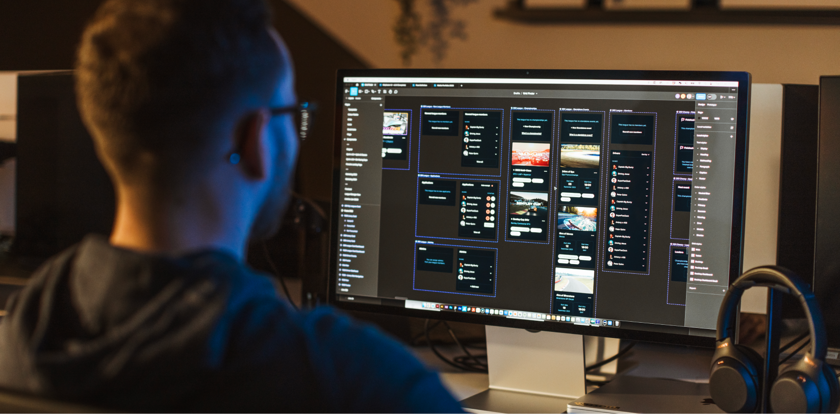
One key way to achieve this is by understanding heuristics and how we can use them to understand how our user’s brains work, and therefore design more intuitive products.
Firstly, what on Earth are heuristics?
Well, a heuristic is a kind of guideline, in short. It’s an experience-based approach to problem-solving. They’re not quite rules or proven solutions, but they do solve problems when it comes to UI design.
In layman’s terms, a heuristic is kind of like a shortcut your brain uses while experiencing the world around it. The concept will become clearer once you see some of the examples below.
Heuristics can help provide a sense of familiarity.
While creating a website or application that looks like no other may be tempting, this approach could hurt you in the long-run.
A recognisable layout and navigation help instil trust into users; people can quickly make their way through pages and find the information they’re looking for.
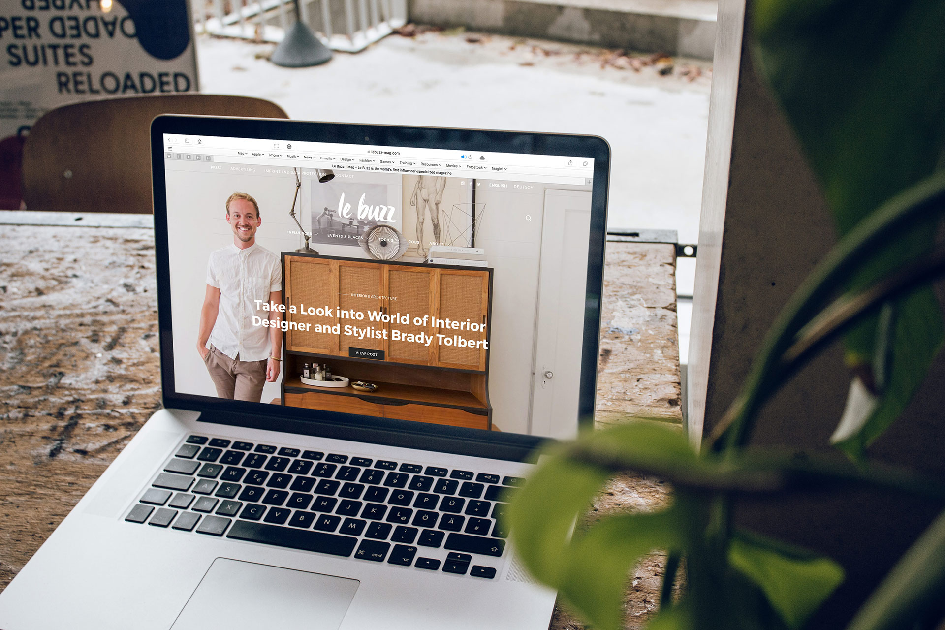
A good example of this is eCommerce websites.
If an image of an online shop just popped into your head, think about what you can see.
Most likely, it’s the typical grid layout displaying certain products and a cart/basket in the top right-hand corner of your screen. Other elements, such as a search bar, a menu of categories and filter options are also common on these types of sites.
This is very different to, say, a news website or blog, right?
Using these heuristics helps develop a sense of familiarity for your user and shouldn’t be shied away from for the sake of trying to be different.
Heuristics help you keep consistency across all pages.
We’ve discussed the importance of consistency before when talking about colours and fonts.
As users navigate through your product, they get used to how different colours mean different things and where everything is on the page.
This doesn’t mean that every page must look identical, but it does mean a certain amount of consistency needs to be created.
A good example of this is the buttons on websites and apps. Google has specific button colours and types for “positive actions”.
Heuristics help reduce the number of clicks.
Getting from A to B should be as smooth and straightforward for your user as possible, and we can use heuristics to help drive things forward.
If you use a consistent layout, familiar navigation system and a standardised way of displaying information, you ease the cognitive load for your user.
Essentially, it’s less brainpower for them to ‘do the thing’ you really want them to do.
Whether it’s submitting an enquiry, signing up to a newsletter or making a purchase, the action should be as simple as possible to achieve.
How many times have you clicked off a website or app because what you’re trying to do is taking too long?
Does this mean I can’t stand out?
Prioritising useability doesn’t mean you have to have a bland website or app. You can still get creative and stand out from your competitors. However, by using heuristics and thinking about how to make your product more user-friendly, your website or app is going to be far more powerful.