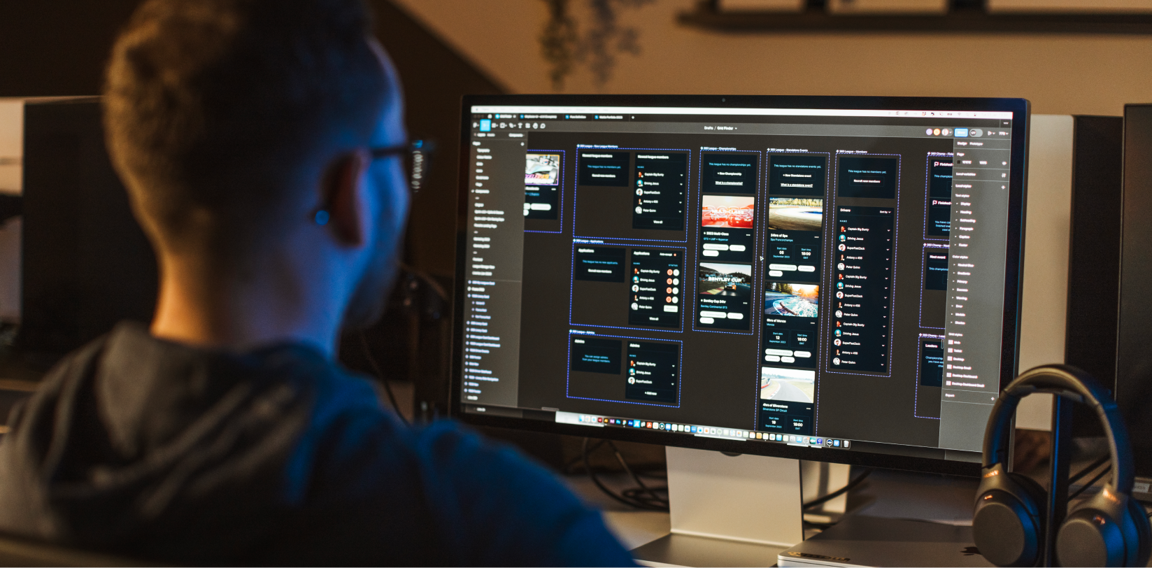
User Interface (UI) is a core part of any website or app design. It determines the way that the user interacts with your product and decides how it’s going to look, feel and sound.
In short, UI is the art of drawing someone into your design, ensuring that the user actually wants to navigate their way through your product.
Today, we’re discussing what you need to consider when creating brilliant UI.
User Experience.
It’s important not to confuse UI with its cousin – UX (User Experience). However, UX must never be disregarded when creating a great interface.
We actually have a blog post dedicated to distinguishing the difference between the two, but basically, UX is how the product flows and functions before the UI Design is implemented. UI is the application of the design elements based on the initial UX research and wireframes.
Naturally, when a designer is deciding about how a product should look, they need to also know how the product works from a technical point of view.
This enables you to create an interface that seamlessly fits in with how the site operates and how the user flow plays out.
Target audience.
The way your end product almost entirely depends on the people you hope will interact with it.
This is why you need to know and understand your audience before beginning any design work, UI or UX. By having a clear picture in mind of your ideal user, you can then build a design that draws them in and makes them want to dive deeper into your website or app.
A good way of testing if your design appeals to your demographic is by testing it with a small focus group.
Visual hierarchy.
When crafting quality UI products, you need to visually highlight the most significant parts of your site. Make the most important call to actions stand out, whether this means visibly enlarging those sections, contrasting colours or using whitespace.
Your goal as a designer is to think of the best way to communicate a message.
It’s essential not to be afraid of thinking outside the box. Reusing the same-old tactics to command people’s attention time and time again can get boring and become counterproductive.
Simplicity.
On the other hand, you must try to find the perfect balance between creativity and simplicity.
There’s no point in over-complicating your interface with wacky, stylistic choices that only confuse your reader.
The main thing about UI is making the product visually easy to understand and access. Your users need to be able to operate your website with ease.
Consistency.
Additionally, a sense of familiarity is a good idea when it comes to interface design. Your audience should feel as though they are at home on your website or app – instinctively knowing how to navigate the product.
Of course, this doesn’t have to mean it looks the same as every other app or website out there, but it does mean that you need to avoid fussy stylistic choices that disrupt their user experience.
Collaboration.
To underscore our first point, designers need to understand the functionality of a product if they wish to produce brilliant UI. This means collaborating and talking with the developers throughout the whole design process.
As with any team, you need to make sure everyone is on the same page and working towards the same goal.
This is why we have adopted such a strong collaborative approach with our client projects, frequently working with a number of professionals from a range of different backgrounds to create brilliant end-products.
If you would like so see some examples of our UI products, please visit our portfolio.


