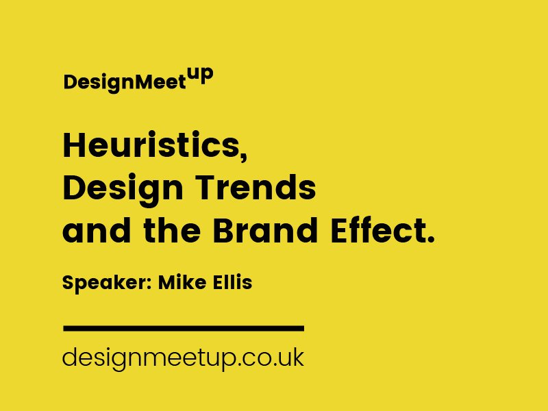
April’s #HullDesignMeetup focused on heuristics, design trends and the brand effect.
Founder of 43 Clicks North Mike Ellis shared his extensive knowledge in consumer behaviour and psychology, which enables him to produce some impressive results via Conversion Rate Optimisation.
What is Conversion Rate Optimisation (CRO)?
“CRO isn’t anything shiny and new, which is why many people overlook it,” Mike tells the room.
CRO is a way of using data and user feedback to improve the performance of your website. It aims to increase the number of visitors who take action, whether this means making an enquiry or purchasing a product.
How can we measure CRO?
Mike explains that one of the primary examples of measuring CRO is A and B testing, where you direct half of your web traffic to one version of your site and the other half to a different version.
In very simple terms, you can see which variant has the best results and adjust your content accordingly.
After pizza and a short networking session, the second part of the talk highlighted the use of heuristics in design.
“A heuristic is a mental shortcut that allows people to solve problems quickly. It’s your brain shortening the amount of time and effort it takes for you to make a decision – kind of like autopilot,” Mike explains.
“Web designers can use heuristics to improve how they communicate with users through design.”

An example of a change in heuristics is the burger menu.
Initially, the icon wasn’t widely known, and it confused a lot of app users. However, nowadays, as everyone has started to use it on mobile sites and applications, the three horizontal lines are instantly recognisable.
Another way we can demonstrate heuristics in design is with website layouts. Almost everyone would be able to distinguish a news platform vs an ecommerce site.
This idea definitely makes sense, as the aim of good web design is to make it as easy as possible for your customer to get to the end goal – taking action, also known as “converting”.
By using heuristics, we can make decisions that guide our users through a frictionless experience, encouraging cognitive ease.
“Each day, we only have a set amount of cognitive effort to spend. People will switch off from your site if they find it too difficult to navigate or complete a task,” he adds.
Design trends that often result in lower CRO.
“Design trends are fun, but sometimes they end up hindering CRO and distracting the user,” Mike reveals.
“Usually, these trends are started by big brands and subsequently adopted by others. People see larger companies and believe what they are doing must be right, so they copy but will probably not see the same results.”
An example of this is carousels that rotate images across your screen.
“It’s distracting and the user is now looking for the next image, rather than consuming the key information on the page. If a travel agent has 100 holidays rotating across your screen, your decision has immediately become more complicated.”
Meanwhile, microinteractions can have the same adverse effect. Too many things happening on one page can increase the cognitive load of your user and put them off doing what you want them to do.
“This is not to say never use these elements – microinteractions can be an effective way to draw attention. It’s about finding where to use these to convert the user, rather than confuse.”
Some key takeaways from the talk:
- Identify the heuristics of your users and use them to guide your decisions.
- Avoid blindly copying competitors and big brands.
- Design to solve problems, not increase cognitive load.
We’ve partnered with TH3 Design, Design Hull and C4DI to create a community that connects, educates and supports those who are interested in design. This isn’t exclusive to designers – although if you are one, you’re going to get a tonne of value from this regular event – it’s open to anyone and everyone who has a passion for the topic.
#HullDesignMeetup is a place for sharing ideas, exchanging bits of knowledge and exploring the true value of design.
We’d love you to be a part of it, so be sure to check out the Hull Design Meetup website. In the meantime, check out 43 Clicks North.


