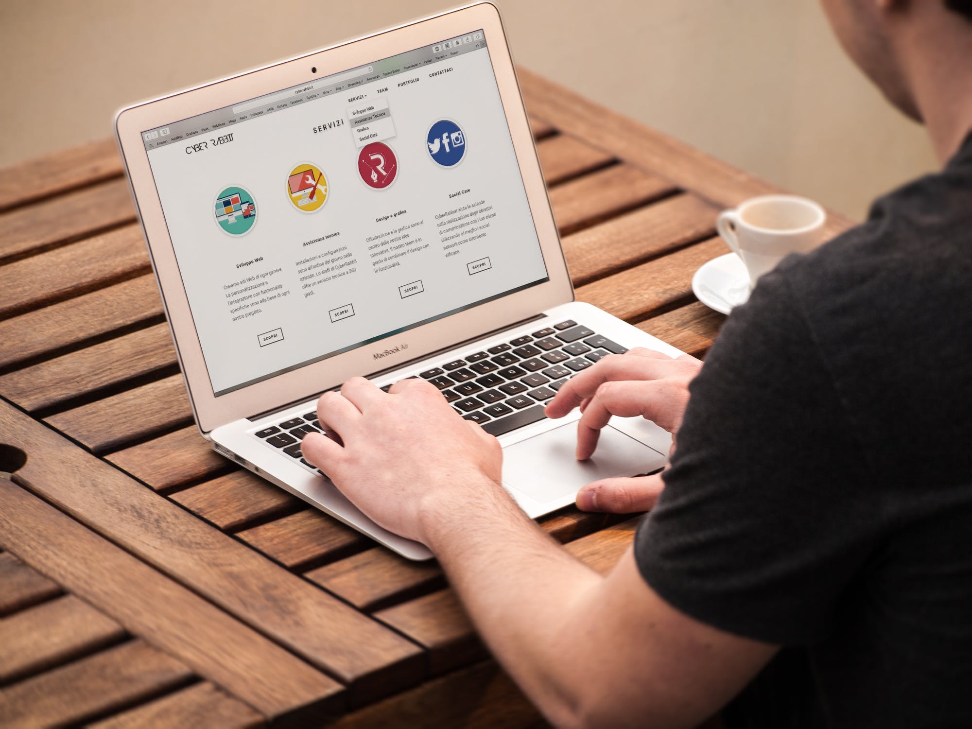
Landing pages are an extremely valuable tool for use on social media, email marketing and PPC campaigns. If you’re looking to improve landing pages, then you’re in the right place.
By effectively directing your audience to a specific call to action, you can maximise your ROI and convert clicks to sales – which, at the end of the day, is what most business owners want from their digital marketing efforts.
But, what makes a great landing page?
Today, we’ve rounded up the ingredients for a for a landing page that packs a punch.
Emotive and eye-catching headline.
Grab your audience’s attention with a heading that connects and converts.
The headline is the first thing the user is going to see, so make sure it says something to your reader that makes them want to continue to spend time on the page.
A good way to achieve this is by speaking in their language to engage with them and pique their interest.
You’ll also want to make it stand out with bold typography.
Read more about choosing the right font here.
You’ve now got to maintain your reader’s interest and showcase what your business has to offer – quickly and clearly. This applies to both products and services.
What tangible things can you offer a potential customer?
Keep it concise and punchy for maximum effect.
Don’t forget the visuals.
The right words are essential but never neglect your landing page design.
Include high-quality imagery that puts your product or service in the best light.
Meanwhile, bring your offering to life with animations, video or micro-interactions.
A clear call to action.
For a landing page, stick with one call to action.
Avoid confusion by limiting the number of decisions a user has to make.
It could be anything from signing up to a mailing list, registering their interest or even buying your product.
Think about what your main aim is for this campaign and work from there.
If you don’t have a solid aim, you may need to rethink your reason for having a landing page or consider creating multiple pages for each aim. This can really improve landing pages and their conversion to help you achieve the best ROI possible.
Test it out.
User testing is a fantastic way to get feedback on your creations.
However, it doesn’t have to cost you a fortune or take a lot of time.
Ask your current customers to test it out and see if they feel moved to sign up or buy from you again.
In the meantime, you could grab an iPad and ask around in your local coffee shop, or another space where your demographic hangs out.
Make sure it can work on mobile.
In 2017, mobile apps accounted for nearly half of global internet traffic.
So, if your landing page isn’t responsive on mobile, we’d say you’re wasting your time.
Read our blog on how to make sure your site is mobile-friendly and responsive here.
Ready to get started with your next landing page? Contact us right now and we can give you some more tips bespoke to your requirements.


