The Grid System has been used in design since the 13th century and is a tried-and-tested way to organise elements in an easy-to-understand format.
Grids were first used when arranging handwriting on paper and then continued to be used in print. Today, it’s a common practice for digital and graphic designers.
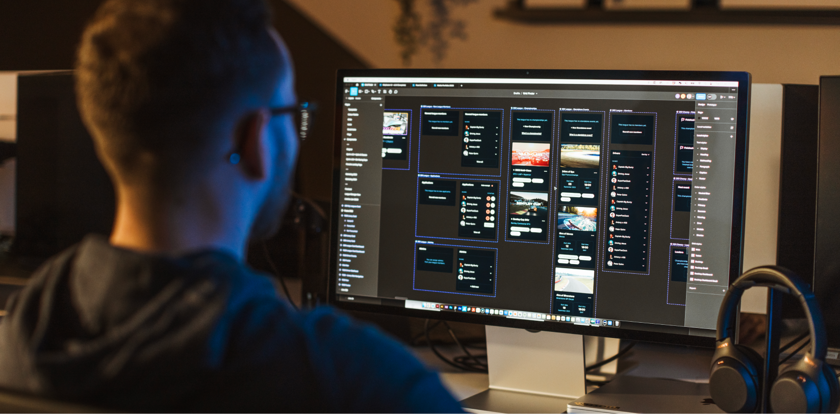
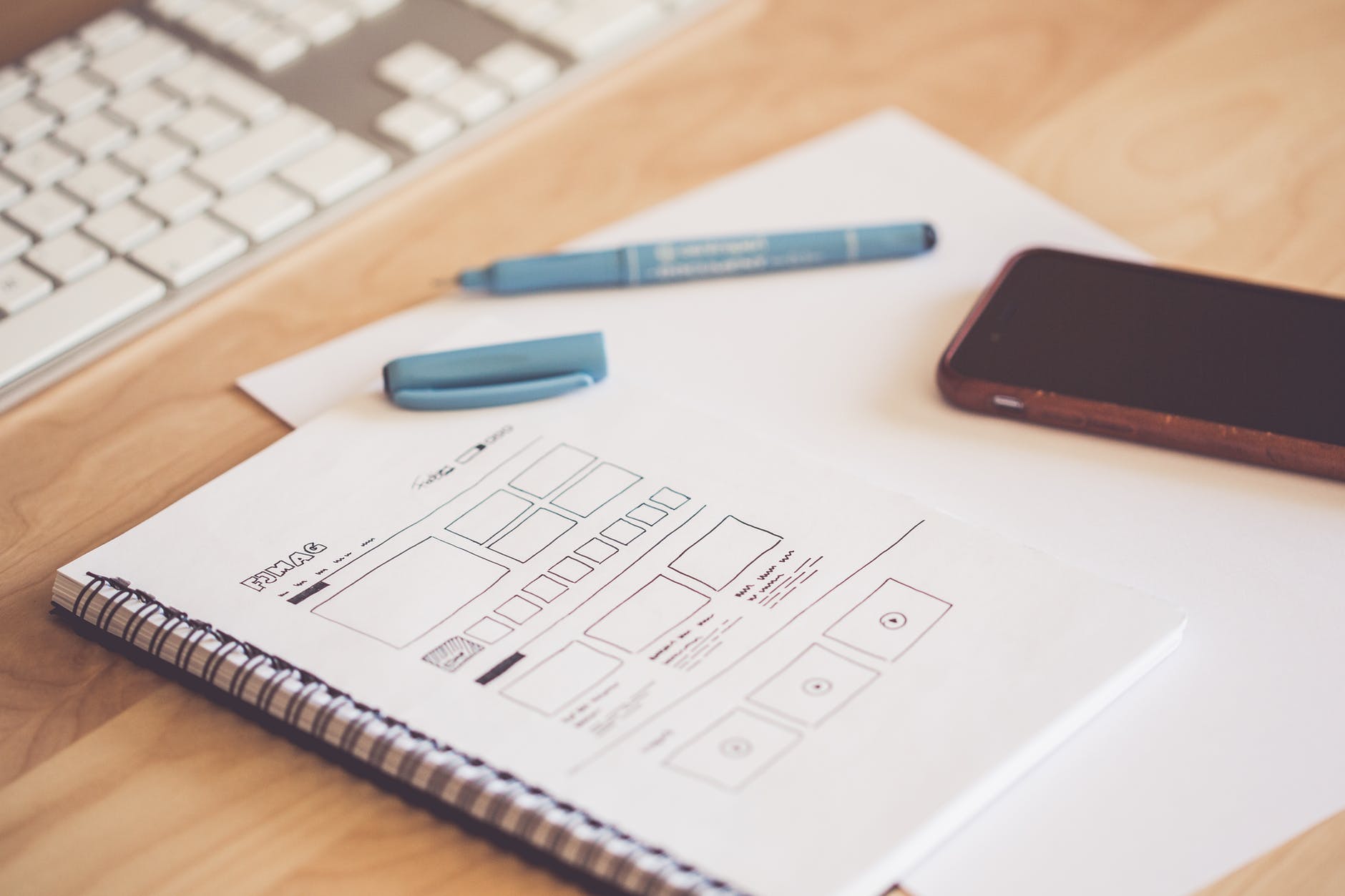
In web design, grids are used to divide the web page up into columns that are then separated with margins. Of course, they’re not visible on the final product, but below highlights how they are used in web design.
Why use grids in UI design?
Grids help us to create clarity and consistency, allowing the user to navigate with ease and digest content effortlessly.
Our aim is to make the experience for our users as frictionless as possible so that customers can quickly scan and find the information they need about our business.
As we’ve mentioned on this blog before, it’s essential for your pages to have a clear call to action, whether it’s “Add to basket” or “Make an enquiry”. A clear grid layout helps users to complete a specific action.
Secondly, grid layouts create a sense of familiarity for users. Even if it’s someone’s first time landing on your site, they’ll roughly know how to get about and where to head to find the information they need.
Plus, making users feel right at home with a familiar layout builds that essential trust between you and your customer.
Grids also enable us to design more efficiently; building pages and arranging content quickly and in a way that is comprehensible to our end-user.
Breaking the grid.
While sticking to a grid layout can result in clarity, familiarity and trustworthiness, you shouldn’t be afraid to push the boundaries and break outside of the grid.
If you want your website to stand out, reflect your creative side and visually engage your audience, broken grids create a unique and eye-catching design.
Overlap and stack elements and adjust grid widths to organise your content in a memorable, interesting way.
Avoid this trap when using grids in design.
As half of all web traffic is now mobile, you must think about designing for different screen sizes.
Think about how your design is going to look on a smartphone or tablet from the very beginning. This will save you time in the long run and help you to avoid wasting time on a brilliant design only for it not to be responsive on mobile.
Getting started with grids and web design.
Whether you want to use grids or break out of them it’s important to figure out who your target audience is and what your main goals for the website are. From here, you can use grids in a way that is tailored to your ideal customer.
For example, if trust and familiarity is a key part of your brand, sticking to a grid format may be beneficial. This will help you to create an effortless user journey for your customers, enabling them to easily navigate through your content.
On the other hand, if you wish to stand out from competitors and inject some instant individuality into your site, breaking the grid is a great option.
And remember, just because you stick to a grid, doesn’t mean your design has to be boring. Likewise, if you use a broken grid, you can still achieve a professional and trustworthy feel.
Key takeaways:
- Grids help create a sense of organised familiarity.
- Break the grid to create an impact with your brand.
- Always think of how your design will look when viewed on mobile phones and tablets.
If you have any questions about grids and how to use them for your website, get in touch with a member of our team right now.