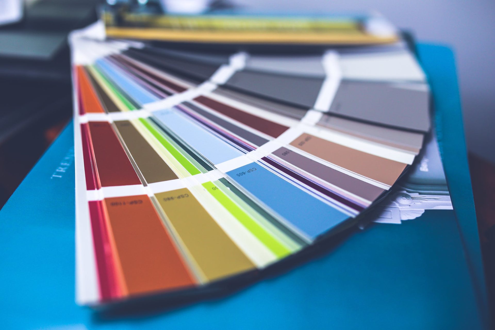
Colour makes a huge difference in the message you’re trying to communicate about your business and brand.
We’ve spoken in depth before on this blog about how different colours impact on our emotions, in a similar way to how fonts have the power change the way we feel about a brand.
However, navigating the world of colour psychology and choosing the right colour palette for your brand can be tricky, especially when there are so many confusing terms and phrases out there.
That’s why we’ve broken down some of the key design and colour terminologies for you below.
By the end of this short blog post, you’ll have a better understanding of the colour wheel, how it works and how you can play with hues, shades, tints and tones to make them work for you, whatever you’re designing for your business.
Exploring the colour wheel.
There are actually three colour wheels; RGB, CMY and RYB.
Today, we’re focusing on the RGB wheel, as it represents the three light sources used to produce colours on your screen and therefore the one you’re most likely to come across.
CMY (often referred to as CYMK) is used for printed materials, while the RYB is used when blending pigment colours.
A primary colour.
As you may remember from art lessons at school, the primary colours of the RGB wheel are red, yellow and blue. These are the hues that – when mixed together – create pure white light.
A secondary colour.
Secondary colours appear when two primary colours are mixed.
For the RGB colour wheel, this is cyan, magenta and yellow.
Red and green light = yellow.
Green and blue light = cyan.
Blue and red light = magenta.
A tertiary colour.
When you combine a secondary with a primary, you’ll get a tertiary colour – orange, chartreuse green, spring green, azure, violet and rose.
What’s the difference between a hue, tint, tone and shade?
Tints.
Tints are created by adding white to your base hue – think back to when you first learnt to mix paints. Useful for making colours less intense, tints help the user to focus on another area of the design.
Shades.
Shades are created by adding black to a hue, usually forming deeper, richer colours.
Tones.
If you add both black and white (grey) to your base, you’ll create a tone. Tones are usually muted versions of your original hue and can be extremely useful for creating variation within your brand guidelines.
Hue.
A hue is another word for a colour on the colour wheel.
Saturation.
Saturation may be more familiar to you in the context of editing photos and images, rather than individual colours. You can adjust the saturation of a hue to make it more/less intense.
Luminance.
When you increase the luminance of a hue, you add light to it. The more luminance, the brighter it is.
Colours play a massive role in design, so it’s crucial that you get them right. We’ve also written guides on how the different colours can convey different messages to your audience, as well as how to select a colour scheme for your website or brand.