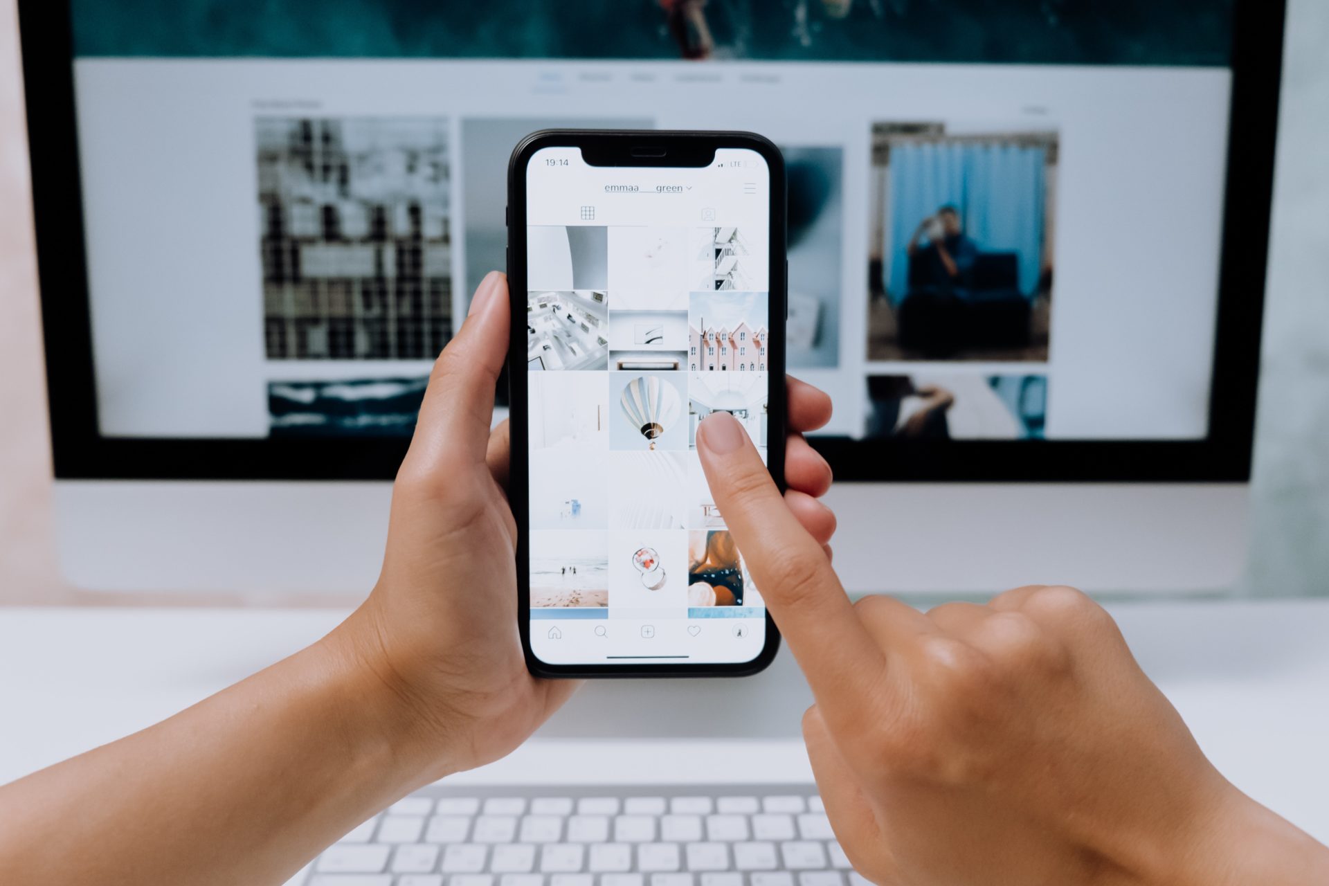
As its name suggests, the mobile-first design principle suggests designing websites and digital products for smaller, mobile screens first before moving onto larger screens, such as desktop and laptops.
With smartphones now accounting for over 50% of all web traffic globally, and the number of mobile phone users rapidly increasing each year, ensuring your website is optimised for handheld devices is more crucial than ever.
Mobile has the most limitations in terms of dimensions and bandwidth, so we’re forced to prioritise the most important content first and therefore ensure the design translates well to a wide range of devices.
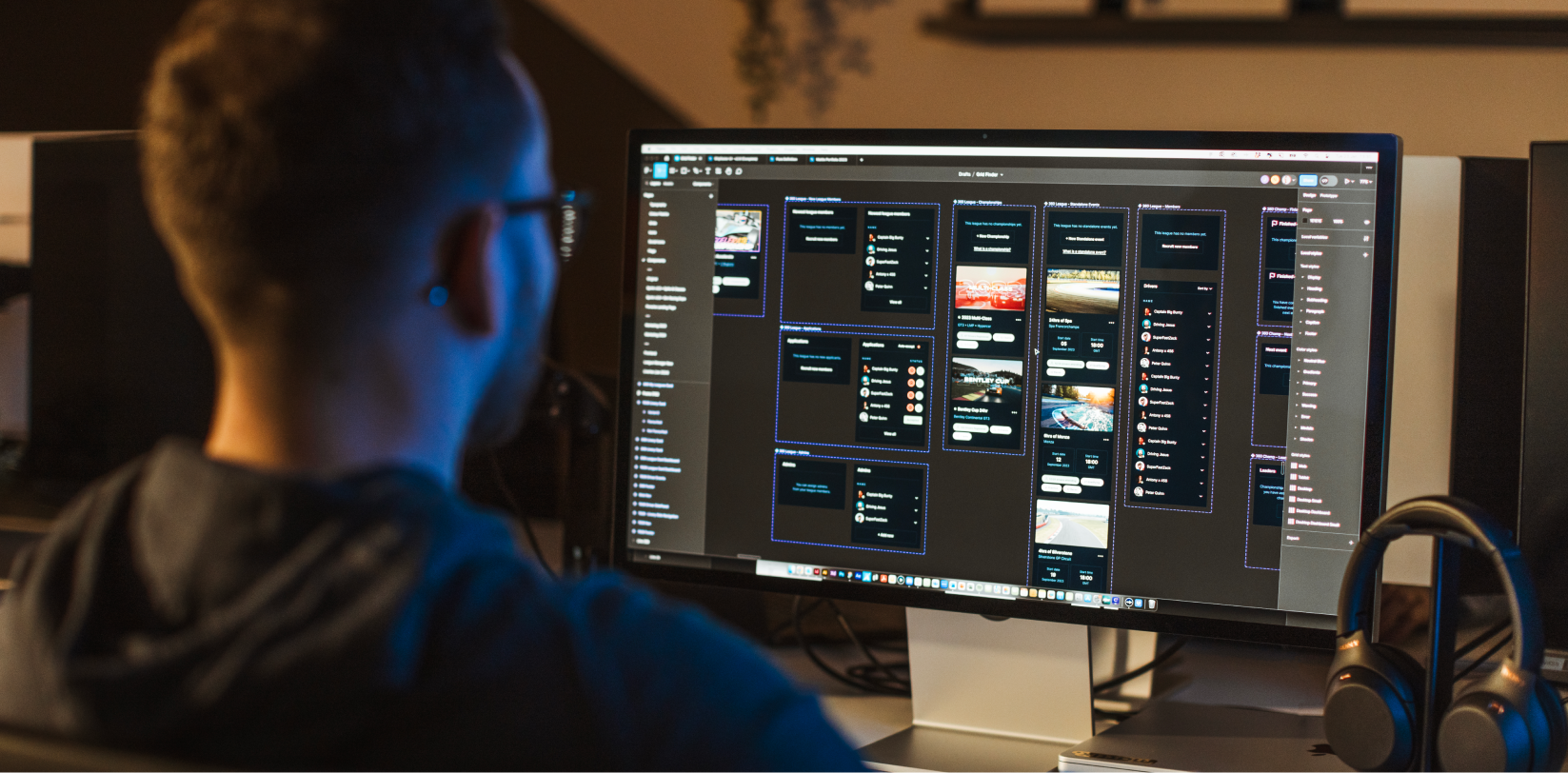
How to get started with mobile-first design.
Figure out what’s important.
Make a list or a spreadsheet of the content you’d like to include on your website and prioritise it in order of importance. This step is crucial in getting started with mobile-first design as it lets you know what elements must be visible when users click through to your site and what can be left out or placed elsewhere.
Keep it simple.
Visual real estate is limited on a handheld screen, so it’s often best to keep your design clear and concise in order to create a frictionless user experience.
Step one should help you filter out the most important pieces of content from the rest.
We recommend following the tips in this blog on Occam’s Razor and how to reduce complexity on your website.
Make navigation frictionless.
In contrast to a computer mouse, our fingers and thumbs are generally wider and less accurate. This is why it’s essential to make sure all of your interactive touchpoints – buttons, menus, links etc – are useable on a handheld device.
The most obvious starting point for this is making sure they are large enough to tap. It’s also important to get position and spacing right on a mobile website. Is your button, menu or link easy for your user to reach with their finger or thumb?
We’ve previously published a blog post on Fitts’ Law that will help you to create clear and clickable elements on your website.
Test it. And then test it again.
It’s always good to put yourself in your users’ shoes. Throughout the design process, test how your content appears on a smaller, mobile screen and check whether your clickable elements work well for handheld interaction.
Don’t be afraid to get other people’s opinions by asking them to test out your design too. If you have the budget, you could even go one step further and set up a group of people drawn from your target audience to test and give feedback.
Key takeaways:
- Design for a smaller, smartphone screen first.
- Make sure clickable elements are useable on a handheld device.
- Prioritise the most important content.
If you have any questions about designing for mobile, get in touch with a member of our team right now.